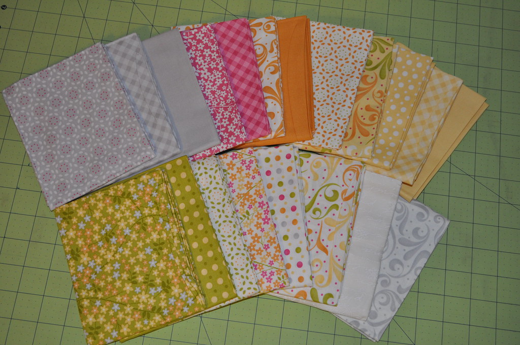
This week's assignment is to work on our fabric choices. Lesly is kind enough to share with us her mistakes from her last go-round so we don't make the same ones.
I am attempting to avoid directional fabrics, because, well... let's face it. They never go the same direction. Something's always turned. Just me? Oh.
I also want to make sure the fabrics have enough definition between them so the blocks don't all blend together.
Thoughts on this set? I realize it's not terribly bold, but it's for a very special person and these colors are right up her alley. They remind me of a summer afternoon, sitting together on her back porch and just chatting. :)


4 comments:
I think those colors will be lovely!I do think it could benefit from a solid-ish green in the mix as well. :)
I hope to have my colors chosen and posted over the weekend. YAY!
Mary
http://www.quiltgenius.com
I do believe there is a solid-esque green in the bundle that I could pull out to replace one of the whites or yellows. :) I have the full line of sunkissed, this is the first time I've attempted to edit down a line and not use the whole thing!
What would you replace with that green?
I'd pull one of the grey's or the white white one
I have this vision... with a birdcage. The white-white one is the base for that block. (it's actually got writing on it if you squint and look really close and then pretend your eyesight isn't that of an 80 year old)... but one of the grays could easily go! I was leaning towards a yellow since there is so much yellow in there, and thought maybe the grays helped provide contrast...
Post a Comment